Contact
Colors
Colors
Colors
Primary color
Primary color
Primary color
#FFCE00
#FFCE00
#FFCE00
secondary color
secondary color
secondary color
#000000
#000000
#000000
ACCENT color
ACCENT color
ACCENT color
#808080
#808080
#808080
bACKGROUND color
bACKGROUND color
bACKGROUND color
#FFFFFF
#FFFFFF
#FFFFFF
Typography
Typography
Typography
Aa
Aa
Aa
Urbanist
Urbanist
Urbanist
Heading
Heading
Heading
Aa
Aa
Aa
Geist
Geist
Geist
Body
Body
Body
Work with us
Work with us
Work with us
Work with us
Work with us
Work with us
Work with us
Work with us
Work with us
Buttons
Buttons
Buttons
Secondary Buttons
Secondary Buttons
Secondary Buttons
Primary Buttons
Primary Buttons
Primary Buttons
Default State:
Default State:
Default State:
Hover State:
Hover State:
Hover State:
Clicked State:
Clicked State:
Clicked State:
Continue
Continue
Continue
Continue
Continue
Continue
Continue
Continue
Continue
style guide
style guide
style guide
Problem
The old website homepage lowered the agency's professional standing and slowed business growth.
The original site was cluttered, disorganized, and lacked a clear color palette. This made the entire user experience feel messy and accidental, which made it hard for corporate clients to trust the agency and stopped them from reaching out.
Problem
Problem
The old website homepage lowered the agency's professional standing and slowed business growth.
The old website homepage lowered the agency's professional standing and slowed business growth.
The original site was cluttered, disorganized, and lacked a clear color palette. This made the entire user experience feel messy and accidental, which made it hard for corporate clients to trust the agency and stopped them from reaching out.
The original site was cluttered, disorganized, and lacked a clear color palette. This made the entire user experience feel messy and accidental, which made it hard for corporate clients to trust the agency and stopped them from reaching out.
solution
solution
solution
Redesigned to enhance visual style and promote easy navigation.
Redesigned to enhance visual style and promote easy navigation.
Redesigned to enhance visual style and promote easy navigation.
I completely overthrew the chaotic interface and engineered a premium, digital experience focused on establishing brand authority and conquering visual chaos. By introducing a strict, minimalist identity system and a clean, spacious grid layout, the final design transforms scattered information into an intuitive and scannable experience that builds immediate corporate trust.
I completely overthrew the chaotic interface and engineered a premium, digital experience focused on establishing brand authority and conquering visual chaos. By introducing a strict, minimalist identity system and a clean, spacious grid layout, the final design transforms scattered information into an intuitive and scannable experience that builds immediate corporate trust.
I completely overthrew the chaotic interface and engineered a premium, digital experience focused on establishing brand authority and conquering visual chaos. By introducing a strict, minimalist identity system and a clean, spacious grid layout, the final design transforms scattered information into an intuitive and scannable experience that builds immediate corporate trust.
KEY DESIGN DECISIONS
KEY DESIGN DECISIONS
KEY DESIGN DECISIONS
Decision 1: Establishing Brand Authority via a Strict Style Guide
Decision 1: Establishing Brand Authority via a Strict Style Guide
Decision 1: Establishing Brand Authority via a Strict Style Guide
The Insight: When shown the original website, users used words like "unpolished" and "confusing" because there were no consistent colors or typography rules.
The Insight: When shown the original website, users used words like "unpolished" and "confusing" because there were no consistent colors or typography rules.
The Insight: When shown the original website, users used words like "unpolished" and "confusing" because there were no consistent colors or typography rules.
The Action: To build immediate corporate trust, I established a minimalist visual identity system through a strict, intentional style guide. By pairing a high-contrast color palette with a structured typographic scale, this system replaced the agency's visual confusion with a cohesive identity that projects quiet authority and reliability.
The Action: To build immediate corporate trust, I established a minimalist visual identity system through a strict, intentional style guide. By pairing a high-contrast color palette with a structured typographic scale, this system replaced the agency's visual confusion with a cohesive identity that projects quiet authority and reliability.
The Action: To build immediate corporate trust, I established a minimalist visual identity system through a strict, intentional style guide. By pairing a high-contrast color palette with a structured typographic scale, this system replaced the agency's visual confusion with a cohesive identity that projects quiet authority and reliability.


Outcome & Reflections
Outcome & Reflections
What I learned from this experience.
What I learned from this experience.
Creating a high-end corporate presence taught me how to balance aesthetics with business goals. Overhauling a cluttered website into a conversion-focused platform was an engaging challenge that shifted my perspective on design simplicity. Here are my key takeaways from the process:
Creating a high-end corporate presence taught me how to balance aesthetics with business goals. Overhauling a cluttered website into a conversion-focused platform was an engaging challenge that shifted my perspective on design simplicity. Here are my key takeaways from the process:
Scrapping the Flash for Function: Early prototype testing with multiple scroll animations proved that excessive movement distracted users from the core PR messaging. Prioritizing a "less is more" philosophy helped maintain a premium corporate tone and reduced cognitive load.
Scrapping the Flash for Function: Early prototype testing with multiple scroll animations proved that excessive movement distracted users from the core PR messaging. Prioritizing a "less is more" philosophy helped maintain a premium corporate tone and reduced cognitive load.
Designing Without an Initial Brand: Building a style guide from scratch taught me how much visual structure relies on brand constraints. Defining the color system and typography scale first saved hours of layout iteration later.
Designing Without an Initial Brand: Building a style guide from scratch taught me how much visual structure relies on brand constraints. Defining the color system and typography scale first saved hours of layout iteration later.
The Power of Content Auditing: I learned that great UX isn't always about adding new features. Often, the best user experience comes from aggressively stripping away clutter to let the core value proposition breathe.
The Power of Content Auditing: I learned that great UX isn't always about adding new features. Often, the best user experience comes from aggressively stripping away clutter to let the core value proposition breathe.
Future Roadmap: Given more time, my next step would be to expand this concept into fully responsive mobile and tablet layouts, ensuring the agency's premium feel scales seamlessly across all devices.
Future Roadmap: Given more time, my next step would be to expand this concept into fully responsive mobile and tablet layouts, ensuring the agency's premium feel scales seamlessly across all devices.
Outcome & Reflections
What I learned from this experience.
Creating a high-end corporate presence taught me how to balance aesthetics with business goals. Overhauling a cluttered website into a conversion-focused platform was an engaging challenge that shifted my perspective on design simplicity. Here are my key takeaways from the process:
Scrapping the Flash for Function: Early prototype testing with multiple scroll animations proved that excessive movement distracted users from the core PR messaging. Prioritizing a "less is more" philosophy helped maintain a premium corporate tone and reduced cognitive load.
Designing Without an Initial Brand: Building a style guide from scratch taught me how much visual structure relies on brand constraints. Defining the color system and typography scale first saved hours of layout iteration later.
The Power of Content Auditing: I learned that great UX isn't always about adding new features. Often, the best user experience comes from aggressively stripping away clutter to let the core value proposition breathe.
Future Roadmap: Given more time, my next step would be to expand this concept into fully responsive mobile and tablet layouts, ensuring the agency's premium feel scales seamlessly across all devices.
Before
Before
Before

After
After
After

Decision 3: Decluttering the Layout & Implementing White Space
Decision 3: Decluttering the Layout & Implementing White Space
Decision 3: Decluttering the Layout & Implementing White Space
The Insight: During user interviews, participants noted that the old site buried their core service details under messy text blocks, causing them to lose focus.
The Insight: During user interviews, participants noted that the old site buried their core service details under messy text blocks, causing them to lose focus.
The Insight: During user interviews, participants noted that the old site buried their core service details under messy text blocks, causing them to lose focus.
The Action: I removed all the clutter and created a clean grid layout. Using plenty of whitespace helped me break the homepage into easy-to-scan sections.
The Action: I removed all the clutter and created a clean grid layout. Using plenty of whitespace helped me break the homepage into easy-to-scan sections.
The Action: I removed all the clutter and created a clean grid layout. Using plenty of whitespace helped me break the homepage into easy-to-scan sections.
Selected Work section
Selected Work section

Service Section
Service Section

Testimonial Section
Testimonial Section
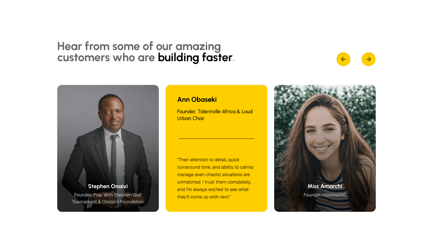
Selected Work section
Service Section
Testimonial Section
Decision 4: Streamlining the Navigation Menu & Path to Contact
Decision 4: Streamlining the Navigation Menu & Path to Contact
Decision 4: Streamlining the Navigation Menu & Path to Contact
The Insight: Users struggled to find contact information because it was buried in disorganized dropdown menus.
The Insight: Users struggled to find contact information because it was buried in disorganized dropdown menus.
The Insight: Users struggled to find contact information because it was buried in disorganized dropdown menus.
The Action: I turned the nav menu into 4 essential tabs. I then designed a high-visibility, persistent "Book a Consultation" Call-to-Action (CTA) button in the top-right header, ensuring the primary business conversion is always one click away.
The Action: I turned the nav menu into 4 essential tabs. I then designed a high-visibility, persistent "Book a Consultation" Call-to-Action (CTA) button in the top-right header, ensuring the primary business conversion is always one click away.
The Action: I turned the nav menu into 4 essential tabs. I then designed a high-visibility, persistent "Book a Consultation" Call-to-Action (CTA) button in the top-right header, ensuring the primary business conversion is always one click away.
Decision 2: Prioritizing Social Proof to Build Immediate Trust
Decision 2: Prioritizing Social Proof to Build Immediate Trust
Decision 2: Prioritizing Social Proof to Build Immediate Trust
The Insight: User experience research confirmed that when corporate clients look for a PR agency, their primary question is, "Who else has trusted you with their reputation?" The original layout buried their client list at the bottom of a chaotic page.
The Insight: User experience research confirmed that when corporate clients look for a PR agency, their primary question is, "Who else has trusted you with their reputation?" The original layout buried their client list at the bottom of a chaotic page.
The Insight: User experience research confirmed that when corporate clients look for a PR agency, their primary question is, "Who else has trusted you with their reputation?" The original layout buried their client list at the bottom of a chaotic page.
The Action: I restructured the layout to place a prominent "Trusted By" logo banner directly underneath the hero section. Placing this social proof above the fold instantly hooks the user, validates the agency's credibility within the first few seconds of being on the landing page, and creates an immediate sense of trust.
The Action: I restructured the layout to place a prominent "Trusted By" logo banner directly underneath the hero section. Placing this social proof above the fold instantly hooks the user, validates the agency's credibility within the first few seconds of being on the landing page, and creates an immediate sense of trust.
The Action: I restructured the layout to place a prominent "Trusted By" logo banner directly underneath the hero section. Placing this social proof above the fold instantly hooks the user, validates the agency's credibility within the first few seconds of being on the landing page, and creates an immediate sense of trust.
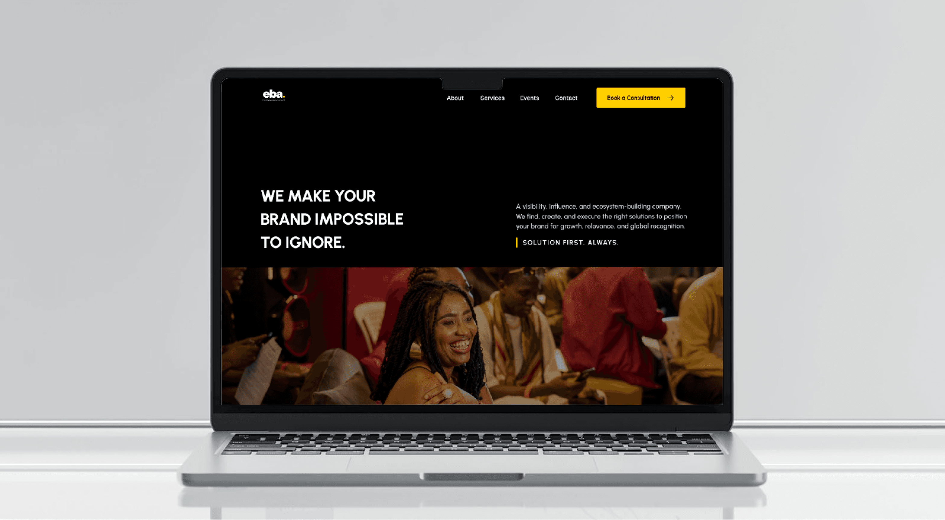
PR COMPANY WEBSITE
PR COMPANY WEBSITE
Enibrand Architect
Enibrand Architect
A homepage redesign concept for a Public Relations (PR) company aiming to elevate their digital presence and better attract high-tier clients.
A homepage redesign concept for a Public Relations (PR) company aiming to elevate their digital presence and better attract high-tier clients.
OVERVIEW
The original Enibrand Architect website was cluttered, disorganized, and lacked a clear brand style, which hurt it’s credibility. To fix this, I managed the entire redesign of the desktop homepage from start to finish researching competitors, establishing a new visual style guide, and building the high-fidelity responsive interface.
The original Enibrand Architect website was cluttered, disorganized, and lacked a clear brand style, which hurt it’s credibility. To fix this, I managed the entire redesign of the desktop homepage from start to finish researching competitors, establishing a new visual style guide, and building the high-fidelity responsive interface.
Contribution
timeline
Feb - Mar 2026
4 weeks
Role
Lead Product Designer
TOOLS
Figma
Framer
ChatGPT
PR COMPANY WEBSITE
Enibrand Architect
A homepage redesign concept for a Public Relations (PR) company aiming to elevate their digital presence and better attract high-tier clients.
OVERVIEW
The original Enibrand Architect website was cluttered, disorganized, and lacked a clear brand style, which hurt it’s credibility. To fix this, I managed the entire redesign of the desktop homepage from start to finish researching competitors, establishing a new visual style guide, and building the high-fidelity responsive interface.
Contribution
timeline
Feb - Mar 2026
4 weeks
Role
Lead Product Designer
TOOLS
Figma
Framer
ChatGPT